This year, I participated for the first time in the 30DayMapChallenge, a yearly event created by Topi Tjukanov, encouraging people to make and share a map with a new theme on each day of November.
Themes of the 30DayMapChallenge 2022
At first I wasn’t sure I would be able to do the full month, but thanks to a mix of planification, long evenings and sometimes abusive re-use, I was able to complete the full 30 days. The whole experience was great and intense. I shared it daily on Twitter and moreover Mastodon, and this served as a nice way to ease my transition from the former to the latter.
Regarding publication, I originally wanted to release everything on GitHub, in a well documented repo like some other participants do. Let’s say it didn’t go as planned :). The neatly organized folder I created before starting the month quickly became a mess of oversized or unused datasets, redundant QGIS projects and copy-pasted deck.gl web apps. The whole challenge felt like a month-long hackathon done besides my daily job, and I didn’t have the time to rush-publish a map everyday AND keep it nice and tidy. And sanitizing everything now feels horribly boring. So, I will just publish this retrospective article, and maybe later push some code for some entries that could be interesting for others.
Entries
Jump to a theme
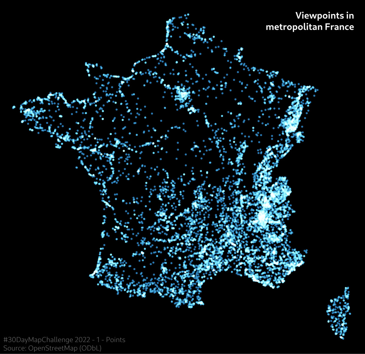
Points
Viewpoints in metropolitan France
Source: OpenStreetMap.
Tool: QGIS.
I started the month with a triptych of formally simple maps to match the simple themes, just trying to get aesthetically pleasing results. This first one is the least abstract of the three, as I linked form (points) and substance (tourism=viewpoint features from OSM).
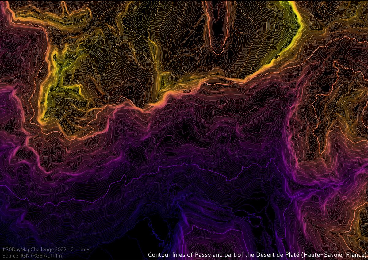
Lines
Contour lines of Passy and south part of the Désert de Platé
Everybody loves relief isolines, for good reason. I chose the area of the French Alps where I spent my last summer holidays. A hike up a very steep ridge made a lasting impression on me, and indeed you can see the cliff very clearly. It was the first of many entries where I had to manipulate a DEM (here the fantastic RGE ALTI dataset from French IGN), so I learned a lot with it.
Polygons
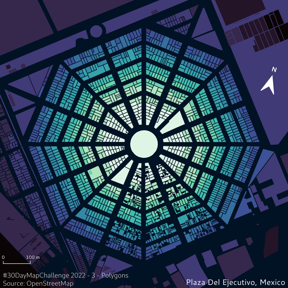
Plaza del Ejecutivo, Mexico City
Source: OpenStreetMap.
Tools: QGIS.
Nice and quick way to emphasize highly-geometric street plans. Just keep the polygons from OSM data and play with their style. Some other places where it’s fun to apply the same treatment: Palmanova or Grammichele in Italy, Neuf-Brisach in France, square-blocked cities like Barcelona and many US cities.
Back to the tools I’m most familiar with: JS mapping libraries. There is no need for interactivity here and the use of deck.gl is overkill for something so simple (MapLibre alone is perfectly capable of mapping all these points). But it served as a flexible template for all other entries based on deck.gl, even if it’s not immediately apparent. I had a code base including GeoJSON data loading and deck.gl view instancing that I could quickly adapt to a lot of other cases.
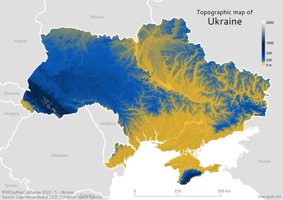
It was a great idea to have “Ukraine” in the list, but my entry for this theme got me mixed feelings. Since the Russian agression, I’ve seen so many incredible maps from newspaper cartographers that the idea of tackling the subject gave me a very strong impostor syndrome. No way I could give it the proper time, respect and context it deserves. Also, to be honest, doing a map about the war or its consequences felt depressing to me. So, I fell back to the simplicities and beauties of physical cartography. I played with the color scale to have the 50/50 ratio of blue and yellow on the flag, with southern/lowest parts of the country in yellow. The abrupt transition between the two colours gives the terrain a much more dramatic look than in reality, with what appear like deep valleys. I reckon it looks nice overall, but I’m not very proud of it. I guess Ukrainians must be tired of seeing all kinds of shallow blue and yellow tributes…
Network
Map of Paris metro/RER network, in the style of vintage lightbulb-based interactive maps found in some stations (aka. PILI) Interactive version
This is the first of some re-uses of past maps I did during the month. From the start I knew I would just re-use some of them as they fitted the themes so well. This one is also a project I’m particularly proud of (even if I never wrote about it on this blog), so it was a pleasure to give it a new chance to be seen.
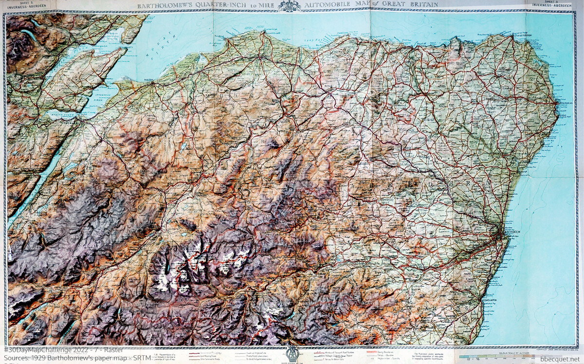
Raster
Relief shading on 1929 map of Cairngorms and Aberdeenshire.
Source: Photo of Bartholomew & Son paper map ; SRTM DEM from NASA.
Heavily inspired by the beautiful work of Scott Reinhard, who gives vintage maps a new dimension by blending modern relief shading with them. This involved a lot of manual steps. Taking a good enough photo of the map, georeferencing it by hand in QGIS (by linking a large number of locations on the photo to their real-world coordinates), tweaking terrain shading parameters, generating a video with a script for sharing. This may seem cumbersome, but this is the kind of stuff I find really cool.
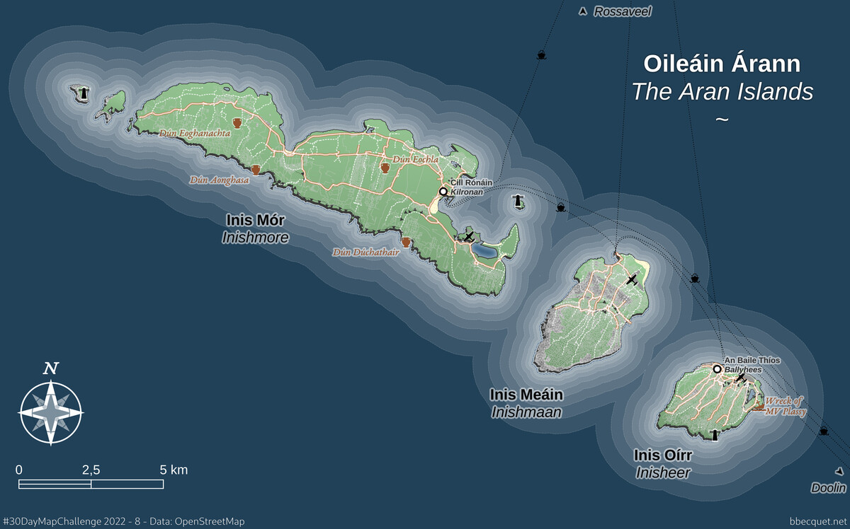
OpenStreetMap
Modern-looking map of the Aran Islands
Source: OpenStreetMap
Tool: QGIS
As the theme was simply “OpenStreetMap”, I just tried to map a place I love. I downloaded the raw OSM data of the area and started completely from scratch with styling, seeing where it would lead me. This is one of these very manual processes, between technology and craft, that I love so much in cartography. I’m no professional cartographer and I lack practice, so there is a lot to say about this map style (these overdone waterlines! :D), but I like the overall look of it.
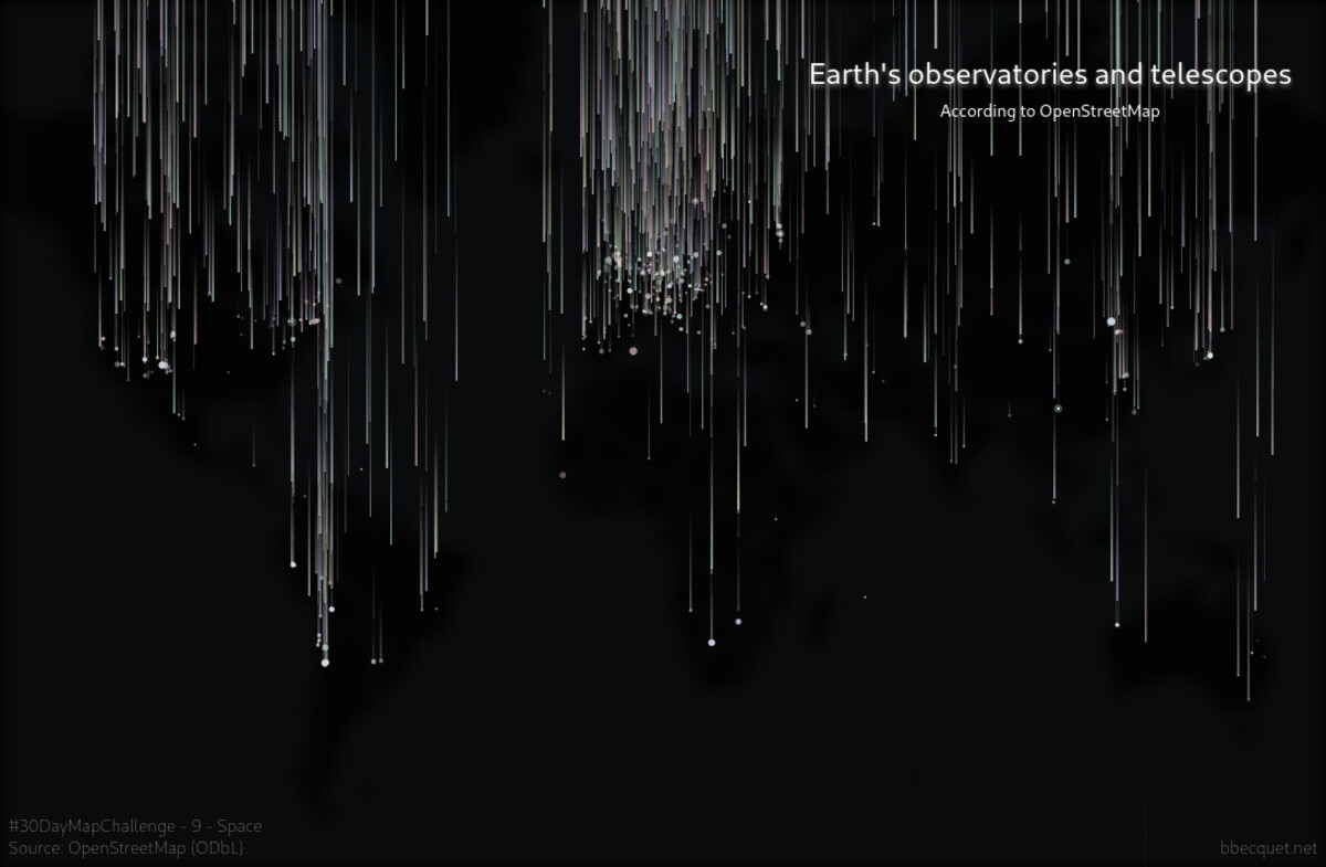
Space
Animated map of Earth’s telescopes and observatories
Source: OpenStreetMap ; background tiles by CARTO.
Tools: deck.gl & MapLibre.
A pretty simple deck.gl dataviz with a twist. Instead of just mapping the points as twinking stars, I made a kind of “meteor rain” effect. It was done by animating a change of latitude across time, and addind random delay so that all stars don’t fall at the same time.
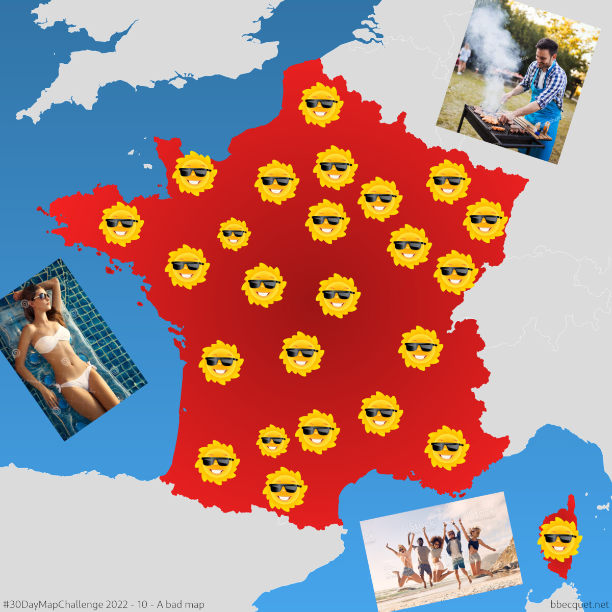
A bad map
Map of global warming as seen by some journalists
Source: Natural Earth ; shitty stock photos and icons.
Tools: QGIS and my bad taste.
Not a very confortable exercise to voluntarily make something bad. At first I wanted to do something along the lines of Terrible Maps, i.e. absurd or meta-joking maps. But I didn’t find any satisfying new idea. So I made this comment about global warming, which was almost painful to create. The result is really horrible, so I guess it fits the theme.
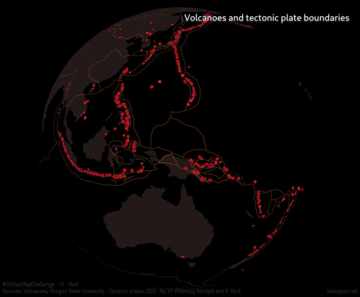
At first I planned to reuse the same Paris background for all four Colour themes, and show fire fighting equipement for Red, but eventually didn’t find this very interesting. My girlfriend suggested volcanoes instead, and I loved the idea. It was nice to use the GlobeView of deck.gl for the first time, even if it’s not very advanced compared to similar JS globe solutions. As for the discarded fire fighting idea, it made an unexpected comeback two days later.
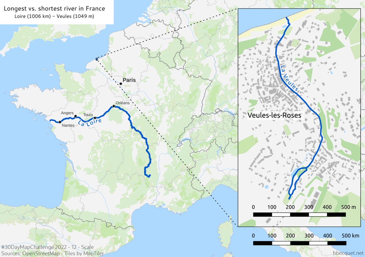
Scale
Comparison between the longest and shortest sea-bound rivers in France
Source: OpenStreetMap ; background tiles from MapTiler.
Tools: QGIS.
”Scale” immediately brought to my mind the idea of a comparison. And I know very well Veules-les-Roses, this lovely place with the smallest river, so it also came naturally. It was fun to make both scalebars align perfectly with that x1000 difference.
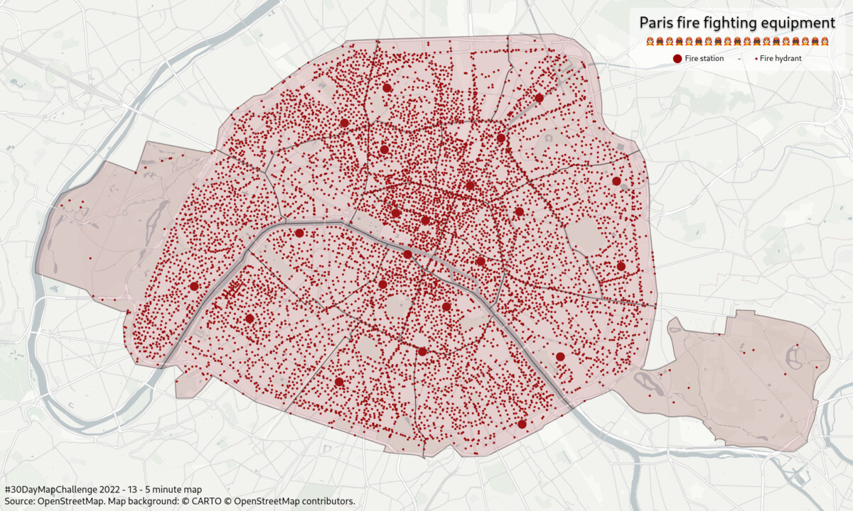
5 minute map
Paris fire fighting equipment
Source: OpenStreetMap.
Tools: deck.gl and MapLibre GL JS.
At first I wanted to show off and make something sophisticated in 5 minutes with the CARTO platform I work on as a developer (with which you can really do impressive stuff in 5 min), but it didn’t go as planned. There was a bug just that day, just on the feature I wanted to use… So I fell back with not much enthusiasm to my original idea for “Red”, changing the dataset and style of my entry from Day 4 in less than five-minutes.
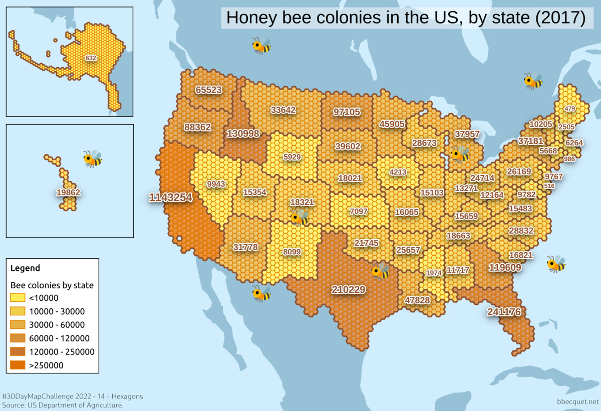
Hexagons
Source: US Department of Agriculture.
Tools: QGIS
This is one of the maps that took the most time, as I had to learn on-the-fly the QGIS techniques to achieve this hexagon tiling. I also spent a lot of time before that looking for a dataset about bees, because I was fixated on this honeycomb idea from the start.
Food/drink
Takeaway fish and chips in the British Isles.
Source: OpenStreetMap ; background tiles by CARTO.
Tools: QGIS, deck.gl and MapLibre GL JS.
Another deck.gl viz adapted from the original template. A technique I use a lot for quick color customization of web maps is CSS filters. With a mix of sepia, hue-rotate, contrast, etc. you can quickly obtain a completely different color scheme with the same data, like this green/blue from the same mono tiles as usual. And it’s easy to test it in real time from the browser dev tools. Maybe I’ll write a small blog post about it at some point.
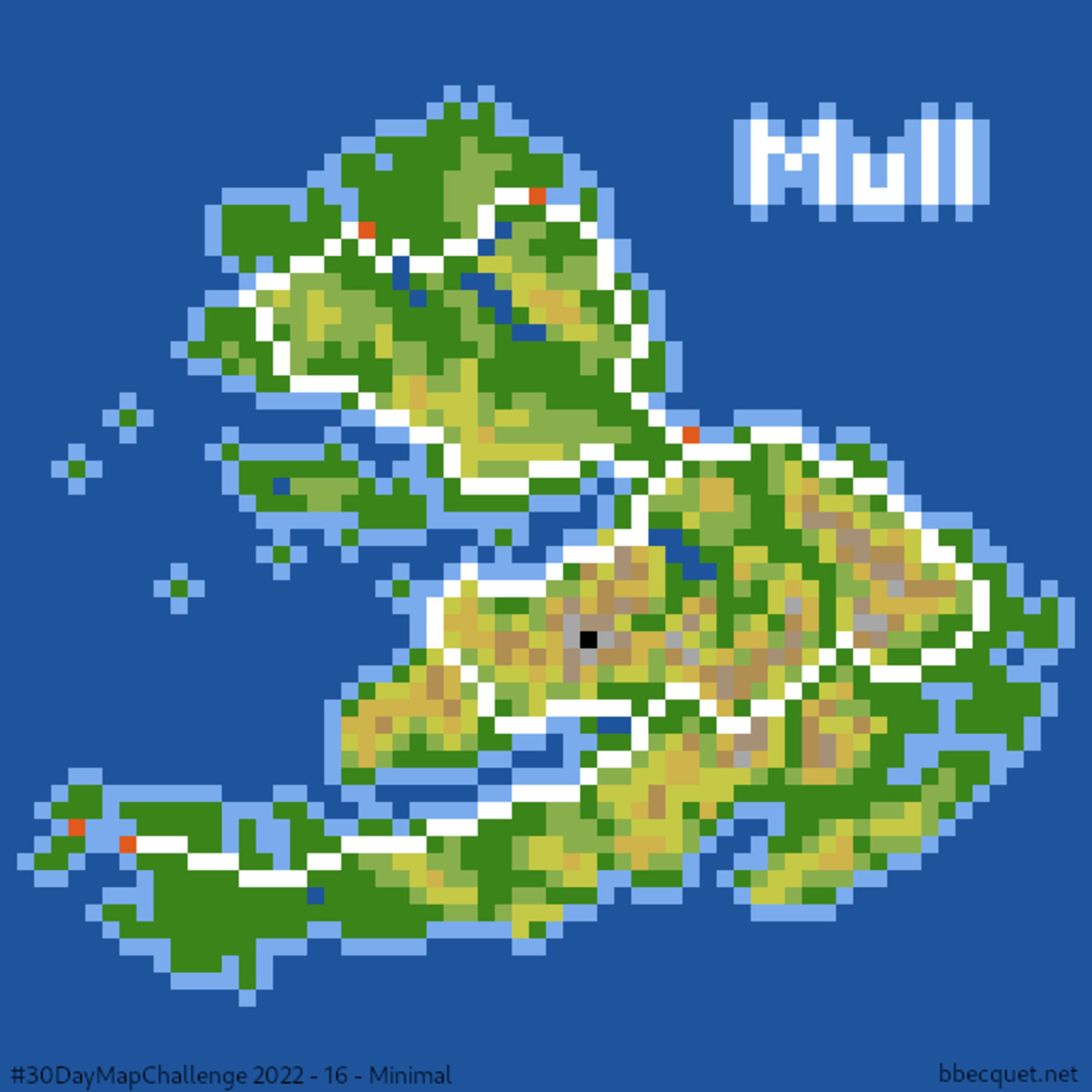
Minimal
64x64 pixel art map of the Isle of Mull, Scotland.
Source: NASA SRTM DEM.
Tools: QGIS and Gimp.
Not sure it really evokes “minimalism”, but pixel art was my first reflex for this theme. I wanted to make everything by hand at first, but it was easier and nicer looking to start with a simplified relief map. So that’s what I did, with my now usual DEM pipeline. I then jumped to Gimp to resize to 64x64, add coastlines, roads and towns manually, and tweak things overall.
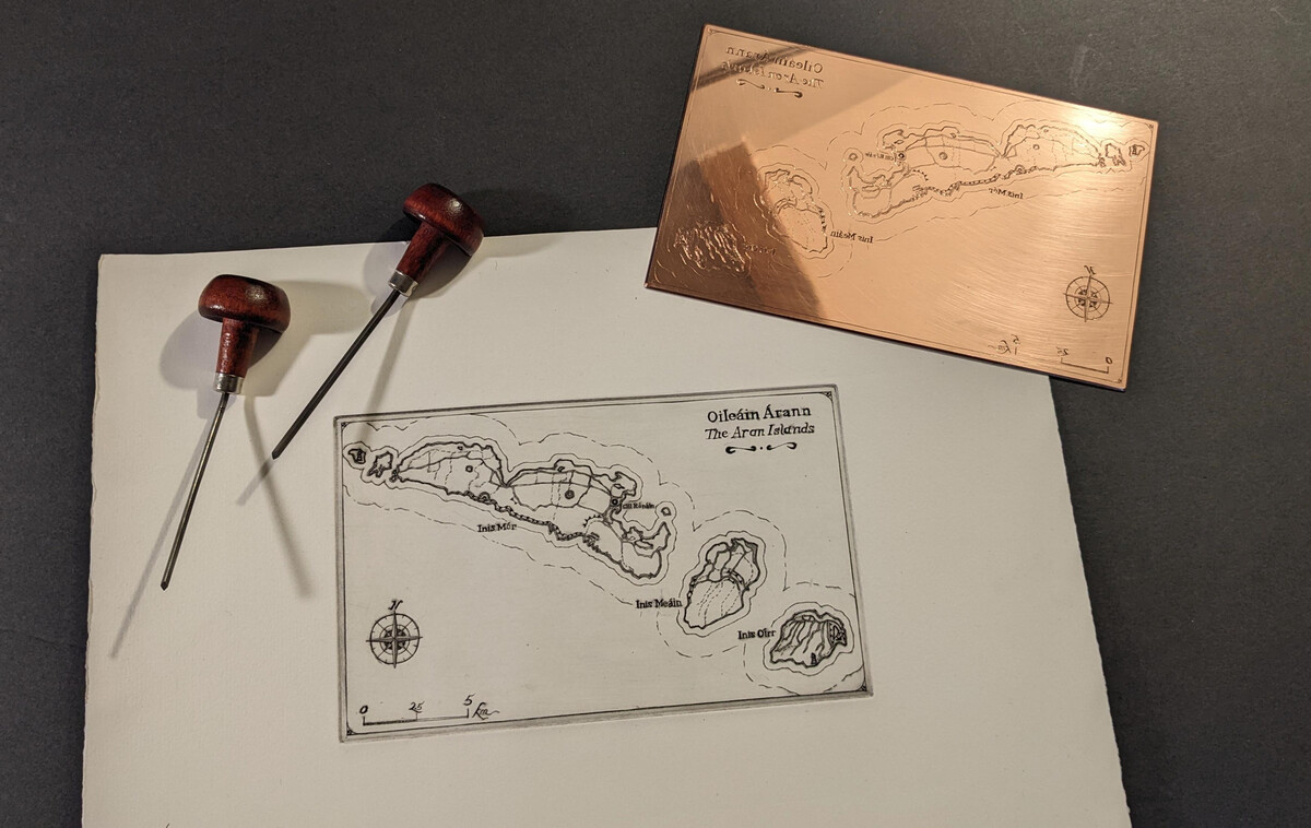
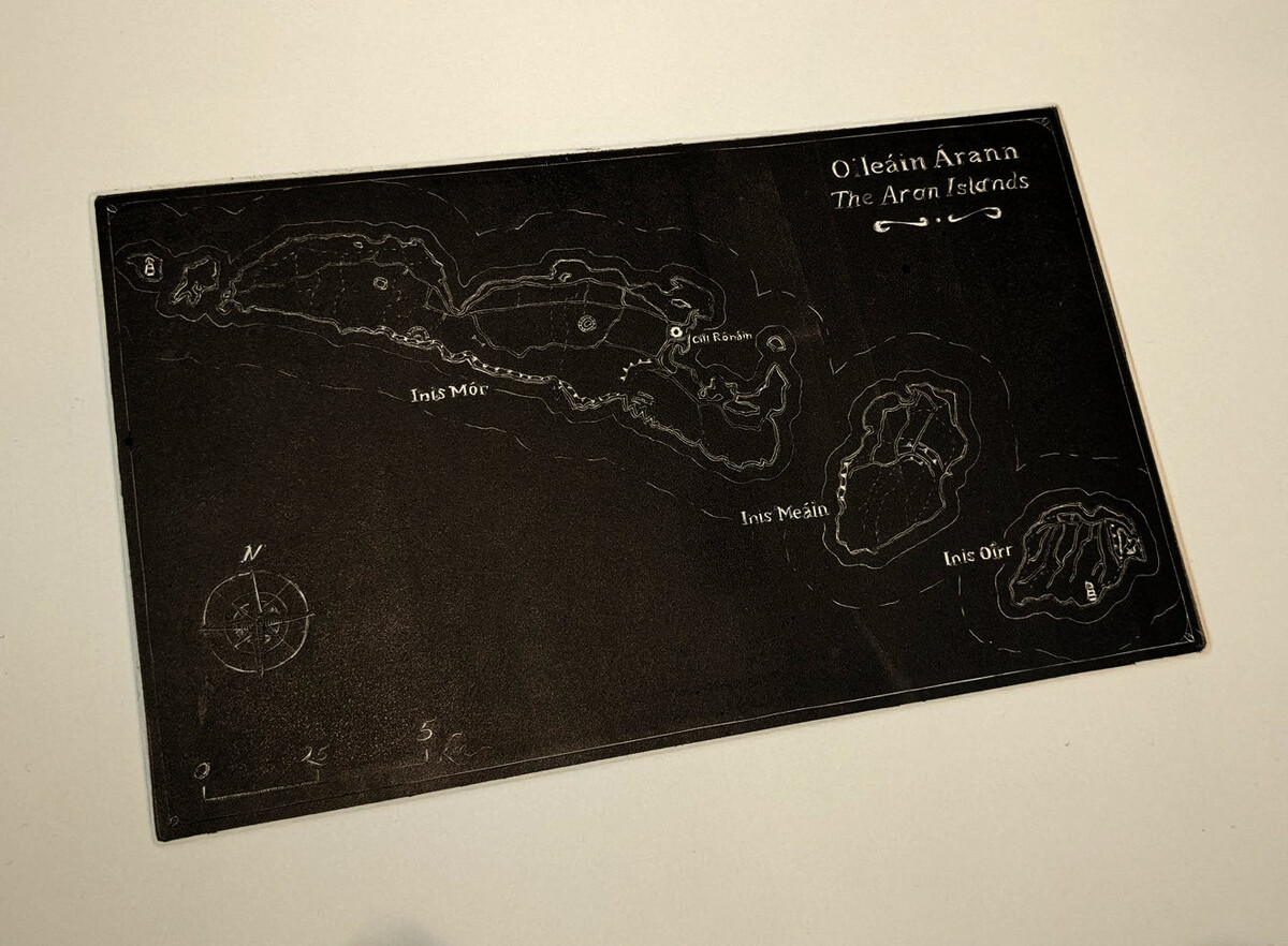
A map without a computer
Engraved map of the Aran Islands
Source: OpenStreetMap
Tools: QGIS for preparation. 11 × 19 cm copper plate, burins, ink and printing press.
This is the most significant entry for me and the main reason why I participated in it. I have big ambitions for applying my practice of intaglio to cartography subjects (this was the origin of this article about warterlining), but I hadn’t started anything concrete yet. The challenge acted as an incentive to finally do something. I prepared a map with the same data I used for Day 8, transferred it to the copper plate, and spent many hours engraving it. I got a showable print the evening before the deadline, at my weekly workshop. It was a really nice experience, and I definitely learned invaluable things that will be useful when I do another map this way. Like, I should find a better technique for texts, because it’s a mess :)
Colour: blue
Oceans of the world
Source: Natural Earth Bathymetry data.
Tools: QGIS.
As I gave up on my plan to make a consistent group of 4 maps about Colour themes, I was left with no idea for this one. Also, I was very busy from work at this point so I couldn’t do something too elaborate. So I focused on aesthetics and simplicity, just playing with nice shades of blue. And I also learned how to do orthographic projections in QGIS.
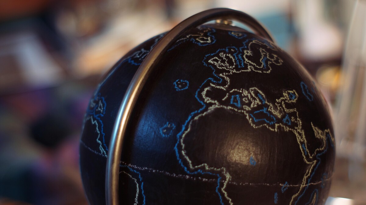
Globe
Blackboard globe
Source: mostly memory.
Tools: chalk on blackboard-painted globe.
Not really a re-use because I redrew it from scratch for the challenge, but this globe is an object I made back in 2014 that I’m still particularly fond of (I actually painted a lot of them which ended on friends’ shelves). Like the engraving, it was nice to make something physical.
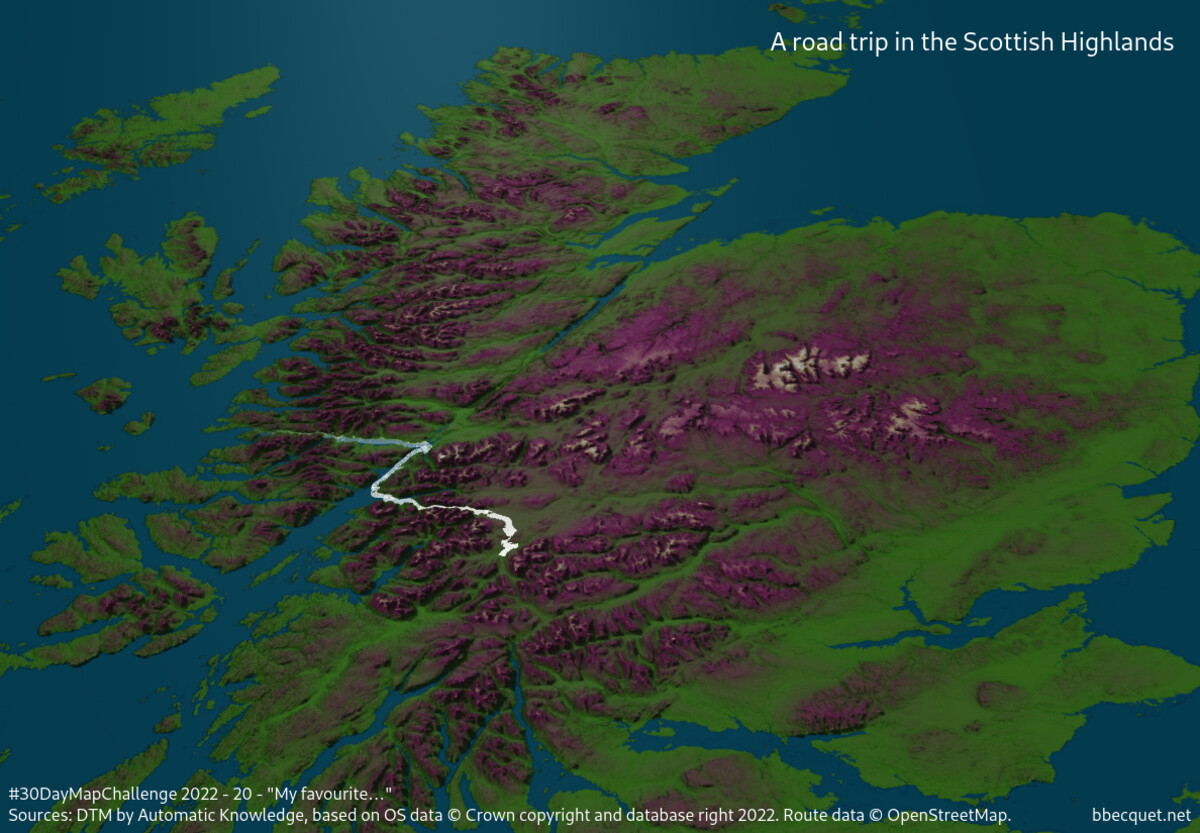
I fell in love with the Scottish Highlands the first time I went there, in 2013. Ever since, I dream I would spend my whole life just driving these roads again and again. I had great fun making this animation. I used QGIS to compute a kind of “ideal” roadtrip from a list of waypoints and to prepare a terrain model of the area, then loaded them in deck.gl. TripsLayer is used to animate the path and TerrainLayer renders the relief.
The green/purple colour scheme that may seem alien to you is a reference to the heather moors that cover large parts of the country. Here is a static version of the trip.
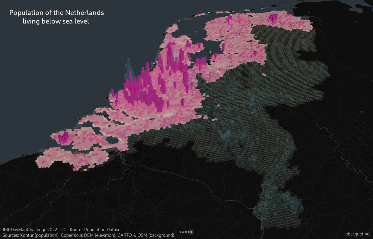
This imposed Kontur dataset is a huge and precise worldwide dataset about population. Using it alone I didn’t see many ways to map something else than these familiar world population density maps. So I narrowed it to a single country, the Netherlands, and mixed it with elevation data to highlight the parts of the country that are below sea level. After the frustration of Day 13, I finally used CARTO for visualization here, as it has great capabilities for 3D thematic mapping.
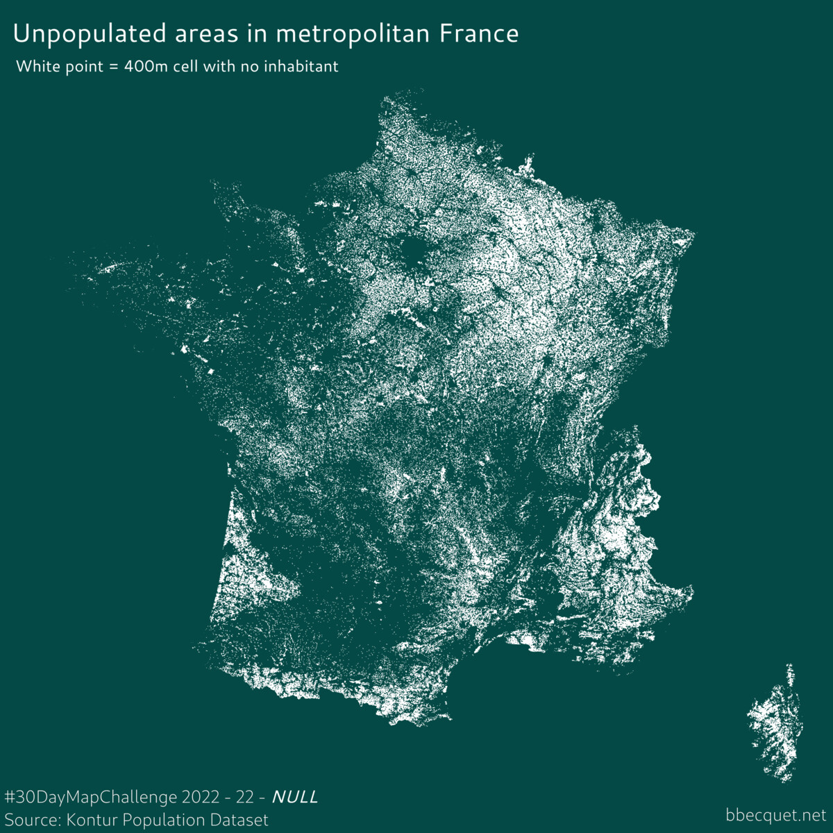
NULL
Unpopulated areas in metropolitan France
Source: Kontur Population Dataset.
Tool: QGIS.
Like all specialised jobs, cartographers like private jokes so Null Island is a common topic for this theme. But I didn’t see how to bring something new to the table so I explored something else. The absence of population was totally on topic and it was a nice way to re-use the same dataset as the day before. I find the result very nice in its simplicity.
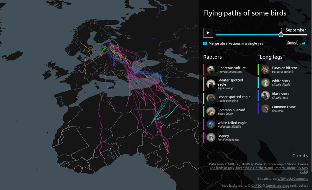
Another perfect theme for re-using one of my favorite personal projects, so no hesitation here. I wrote specifically about this one earlier this year.
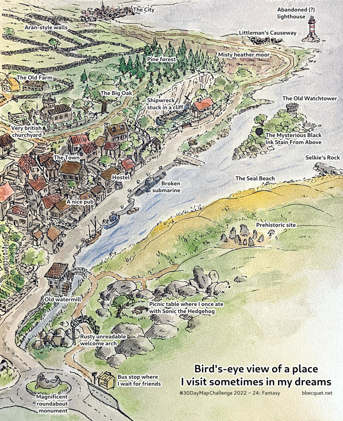
Fantasy
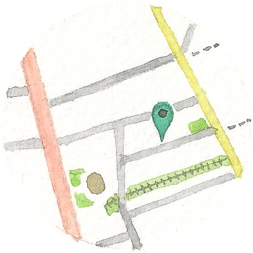
Bird’s-eye view of a place I’ve visited three times in dreams.
Source: memory of my dreams.
Tools: India ink, watercolors, QGIS.
There is often a powerful sense of place in my dreams. This location must have marked me a lot because I dreamt about it three times last year. There were of course some variations and different events, but it was the same general place with recognizable features. On the second time, I drew a quick doodle of it in the morning, that I completed the third time. This was the source of this drawing. It’s funny for me to see how undeniably British it looks, with even an obvious influence from Tobermory. In any case, it was nice to do some watercolor, a medium I rarely use. And ironically, even if it doesn’t use any data I still found QGIS layout manager the easiest way to place and style the toponyms after scanning. No wonder after so much intense use.
Colour: 2 colours
World occurences of Black kite and Red kite.
Source: Global Biodiversity Information Facility ; Natural Earth countries.
Tools: QGIS.
For this two-colour theme I chose as a subject one of my favorite birds, the Red kite, and its close cousin the Black kite. I learned during the making of this map that the Black kite is the most common bird of prey in the world, even if not present in the Americas. It helps that kites are very opportunistic in their food choice and much more gregarious than other raptor species. Even in France you can sometimes see Black kites in flocks, with some Red ones among them if you are lucky.
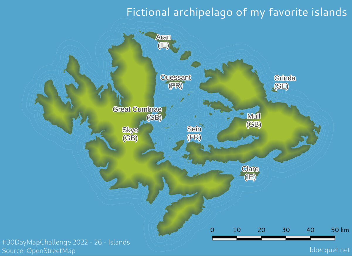
Island(s)
Fictional archipelago of my favorite islands.
Source: OpenStreetMap.
Tools: QGIS.
I had explored the theme of islands multiple times before, so for this one I wanted to make a kind of pot-pourri, creating an archipelago with most of the islands I’ve set foot on and love. It was fun dragging their landmasses to an empty place in the Atlantic, comparing their actual scales, and arrange them to my liking as if I was playing some god-like video game. So fun that I forgot to save my game project regularly, and QGIS decided to crash at that moment. I wasn’t angry at it because it had handled giga-size datasets like a charm the whole month, but I still lost one hour of work and most of my energy. What you see here is a quickly redone version, much simpler, with many less islands that originally planned.
After the bad surprise of the previous day and the whole month clearly beginning to take its toll on me, I was glad to have another theme where I could re-use an old project. I still took some time to improve the original project, by updating libraries, improving matches display, adding an intro text and fixing long-standing bugs. I wrote about it some years ago on this blog.
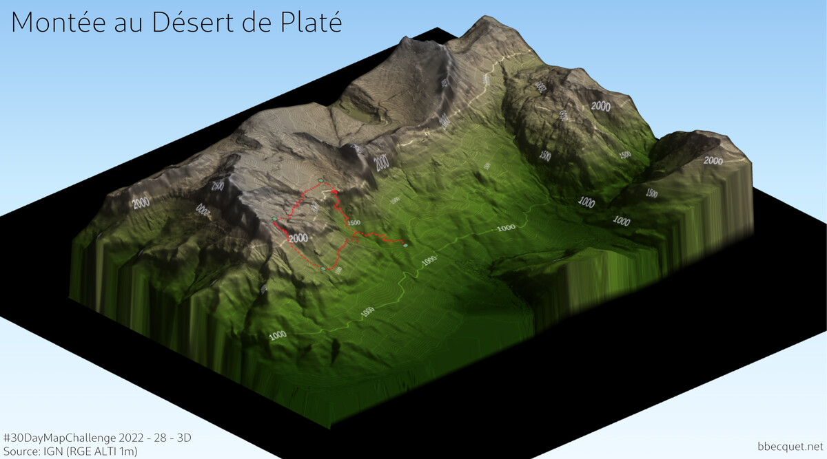
That was one of the only themes where I started the day not knowing what to do. Finally, after seeing multiple people using the Qgis2threejs plugin, I also gave it a try, re-using the relief data from Day 2 and adding the hike itinerary. The plugin itself only deals with camera and export, the result depends on the data and the styling you apply, but it really took me 5 minutes to get a web page with a 3D model that can be rotated and zoomed. Nice! Actually I couldn’t resist trying it on another area, so I chose a part of the Isle of Skye (Scotland, once again :)).
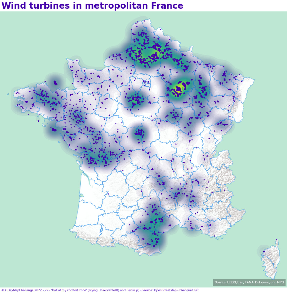
There are many ways to interpret “out of my comfort zone”, but as I didn’t have a lot of time I chose the most obvious: trying a tool I never used. In that case the Bertin.js library, here in the context of Observable, a popular tool for creating dataviz dashboards mixing dynamic code and text. Ok, it wasn’t that much out of my comfort zone, as they are JS tools. But it was perfect for a quick entry at the busy end of the month. And I really loved the simple approach of declarative mapping taken by Bertin.js.
Remix
Alternative way of printing the engraved map of Aran Islands
Source: OpenStreetMap.
Tools: QGIS for preparation. 11 × 19 cm copper plate, burins, ink, brayer and printing press.
For the last entry, I came back to my engraved map from Day 17, that I constantly tweaked and improved after the first prints anyway, and I used a different printing way. For deep enough intaglio techniques (ex: strong line etchings or engravings), it’s possible to use the same printing principle as relief printing (ex: woodblock or linocut), where what gets printed are the untouched areas of the plate. You basically get a negative of the normal image, which is exactly what it is here. You can even mix both ways on the same print, where cuts are inked traditionally and it’s only after that you pass the brayer, like on this blue print I also did.
The end.
Phew! :)
Afterthoughts
This 30DayMapChallenge 2022 was overall a wonderful source of learning and a great deal of fun. Some highlights for me:
using QGIS so extensively, an application I love but don’t have much occasion to use in my professional life ;
doing funny things with deck.gl, a tool that on the contrary I use at work but in an indirect and limited way ;
manipulating elevation models and doing different sort of relief mapping ;
and of course, the engraved map I finally got to make. Future will say if it’s the start of something!
It actually took more than a month, as the list of themes is published some weeks before and your mind starts clicking to find ideas well before the 1st of November. It’s also a good time to plan things, hunt for datasets (which can be very time-consuming), organize a project folder, etc. And of course, nothing prevents you from creating the maps in advance. But when the months starts, with all other contributors publishing incredible maps, it’s really something else!
I’m glad I got to the end of the month without missing a day. I started the challenge by saying it wouldn’t be a big deal if I let some days off by lack of time, energy or motivation. And indeed it wouldn’t have been. But after you get some traction with this kind of daily challenge, you often end up finding resources to go on.
That said, these resources are in limited supply. Roughly, the first half of the month went well, but I started to feel some fatigue during the second, and I was relieved when the month ended. Couldn’t have gone much more at this rhythm. I don’t know how it is for professional cartographers, already working on these tools all day and very efficient with them. As a software developer, it was sometimes hard to spend most of my free time on this other demanding occupation. Even when I wasn’t making a map, I was probably thinking about the next map to make. I had a rough end of year at work, feeling sometimes on the edge of burn out… and I can’t help but thinking the focus and energy I invested in parallel in the 30DayMapChallenge had a part in it. So, if I do the challenge next year, I’ll be careful to find a better balance, and having done it a first time will be a great help.