An interactive map of migrating birds
Some weeks ago, there was a hackathon at my work at CARTO. The goal was to experiment with all the mapping tools we build and to propose original ways of presenting spatial data. I looked for some nice open datasets we could use, and of course I searched first for nature-related data. That’s how I stumbled upon this set of GPS positions of birds from Northern Europe, on the Global Biodiversity Information Facility, a website that will never leave my bookmarks from now on.
Eventually our hackathon team decided to go with another topic, but I wanted to come back to this bird dataset on my own to build something cool with it.
Finding a candidate dataset to map is just the beginning. You also need to understand the data, and see if it carries enough information for your purpose. Usually it starts with identifying the geographic attributes and some classification pattern. Loading the raw data in QGIS and playing with values often gives you a good sense of what it represents and how. I’ve always loved this exploration phase, even if sometimes the result can be disappointing. But here it looked very great!
The actual data here is pretty simple. These are GPS positions of some individual birds, from species falling in two “groups”: birds of prey (eagles, buzzards, etc.) and some species of long-legged birds like cranes and storks1. Actual taxonomy is more complicated than that but this is ok here. Probably only these species are represented because they are those large enough to carry a long-running GPS device.
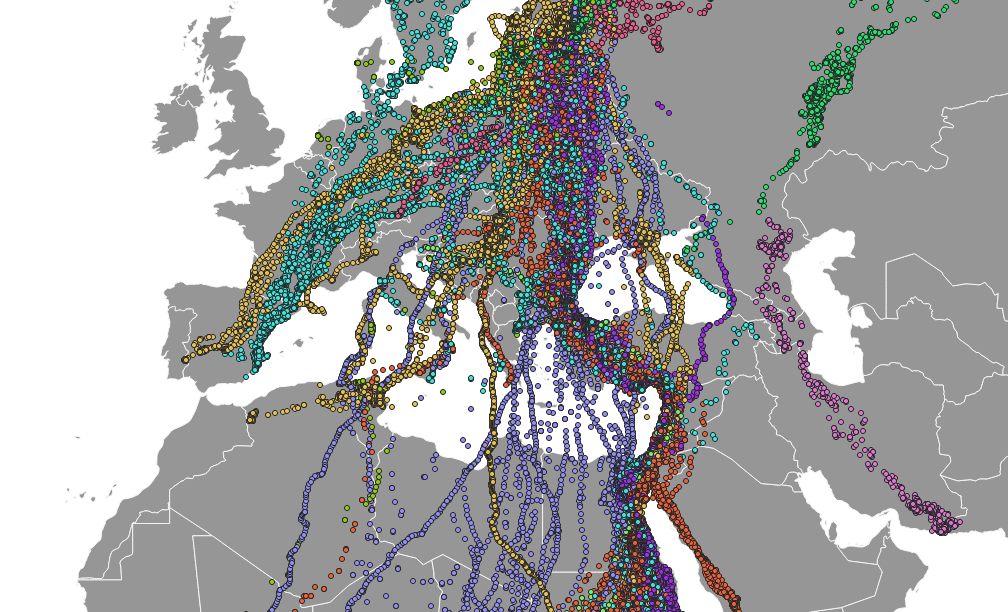
What makes this dataset so great, already apparent in the quick QGIS preview, is that they are all migrating species. Birds are tracked as they pass warm months in northern Europe, before moving to Africa, Middle-East or southern Europe at the end of the summer, and flying toward north again in winter. I wanted to build a map to focus on these migration patterns.
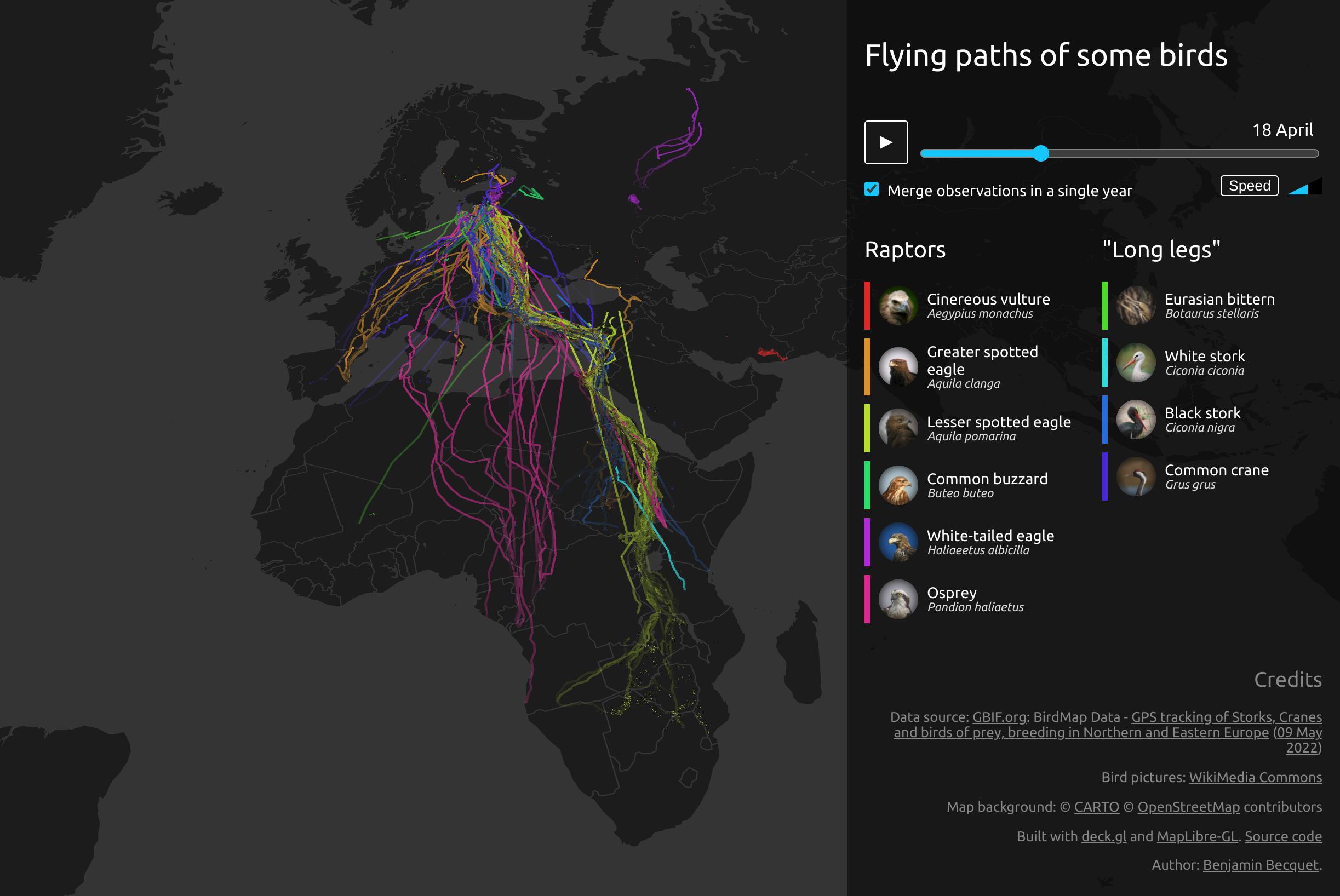
Here is a link to the interactive map.
⚠️ I didn’t embed it directly in this article, because it can be quite heavy in CPU. So, be warned if you open it on a small device.
Alternatively, a video of it, running at the highest speed setting:
I think I can watch forever these two opposite waves, of spring and autumn. There is something inherently joyful in them, maybe it’s imagining a multitude of magnificent birds rushing in the same direction at the same time.
There is some level of “cheating” involved though. The dataset is made of observations recorded over more than ten years, so if you just plot the original data, you have multiple smaller waves, and some years had few birds recorded. I preferred these two big tsunamis of birds, so by default all observations are merged on a single, fictional year. You can disable this option to stay true to the actual data.
For the visualization itself I used the awesome deck.gl dataviz library. At CARTO we are big users and contributors of the project, so I was already familiar with it. It does 90% of the work, really, thanks to its TripsLayer class which is dedicated exactly to this use case of animating linear geometries. You just have to provide coordinates linked to timestamps, have a timer update the current time, and deck.gl takes care of what should be displayed at any moment.
So, after the data was correctly sanitized and prepared, I got most of it working in raw JS in a matter of minutes, soon spending more time tuning line style and animation speed. It was all fun and games until I wanted to make something interactive and reliable. Like changing some setting somewhere in real-time and being sure it gets consistently applied everywhere… The management of time options in both UI and internal data was enough for me to reach the familiar tipping point where I almost always switch to a React application. After 7 years or so of professional React and teaching it multiple times, it’s normal that it’s my go-to solution, but sometimes I wonder if I can just think differently anymore…
Anyway, this was fun. I’ll try visualizing similar datasets if I find some, maybe with other ways of representing data. And I’d also like to understand the reason for the small visual artefacts that sometimes remain under lines…
Here is the source code.
Footnotes
-
Speaking of storks, I spent the last days at a work meeting in Alcalá de Henares in Spain, and I was amazed to see there were stork nests everywhere! The large birds were gliding above us while we visited the historical town. My Spanish colleagues were unimpressed, but I spent most of the tour looking at the sky. ↩