Labelling alternative routes
Providing alternative routes is now a very common feature of cartographic and route computing applications. All general public applications have been doing it for a long time. More than 10 years ago, as part of my job for a road traffic data company, I developed a Europe-spanning routing engine from scratch and also added capabilities to compute alternative routes.
Compared to other complexities in this field, like performance or managing multiple means of transport, calculating multiple routes is relatively easy to achieve. Pathfinding algorithms traditionally stop as soon as they have found the optimal (or a near-optimal) route, but it’s possible to let them run past this point to yield more results. In this multitude of less-than-best possibilities, you keep the ones that would be relevant real-life alternatives. Typically, they have to be different enough from the best path, while not taking too much longer.
The problem
Besides these algorithmics, proposing alternative routes to map users also pose specific UX challenges.
I currently work on Qwant Maps, the map application of the Qwant search engine. When presenting itinerary results, Qwant Maps can display at most three different routes on the map. Textual information such as each route’s length, duration and access to the full roadmap is displayed in a side panel. But it’s useful to also show a summary of this information on the map, as small labels directly linked to the geographic representations of routes. It helps the user understand the full situation and the differences between each alternative by a quick glance at the map.
These labels also serve another purpose. The route lines can be clicked to focus one alternative in particular. But a thin line is hard to target with a pointing device, and even more with a finger on touch-based devices. By offering larger interactive areas, the route labels provide a better way to switch from one route to another.
So, route labels are great for UX. But to be useful, they need to be positioned accordingly to each route set. After some trials and errors, some criteria for the good placement of labels tend to emerge. I kept two of them:
- Labels should point at parts of the routes which are non-ambiguous.
- Labels should not overlap each other.
Labelling non-ambiguous parts
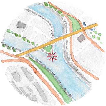
When thinking about alternative routes, the first situation that comes to mind is this one:
From origin to destination, there are multiple paths, and along their whole length, each one is completely distinct from the other ones. Anchoring labels anywhere on the lines would be unambiguous, and the easiest solution is to do it at mid-length, like the map shows.
Although such cases exist (all examples, including this one, are real-life results from the Mapbox Routing API), they are not common. In nearly all cases, due to the nature of road networks, the different ways to drive or cycle from one point to another will share some parts with each other, at the beginning or end of the routes.
You may be lucky and still find situations where the alternatives are distinct enough for the mid-length option to work. For example, this typical parisian dilemna:
But most of the time, the results are much less balanced and the naive approach doesn’t hold. When multiple labels point at a part common to multiple routes, they become ambiguous, therefore useless.
Because our brains are good at solving visual problems, humans often find intuitively good solutions to cartographic problems. The difficulty is in translating the intuitive reasoning into an algorithmic form and make sure it works for the infinity of real-world cases.
Here, it looks quite obvious we should anchor the labels on parts of routes that are unique to each of them. So, the problem comes down to finding these sections.
If you have control over the routing engine implementation, you could make this information available as a by-product of the computation of alternative routes. But most of the time, map applications will use an external routing API that doesn’t provide it. The most generic is to assume routes are represented as lists of coordinates.
The algorithm I developed works in two steps:
- count the number of occurences of each coordinates across the whole set.
- for each route, take the first continuous section where coordinates are used only once in the whole set.


The first step needs to create a dictionary of the coordinates to count them. At first I tried to find an in-place solution, but the complexity was higher, with repeated linear look-ups in often big arrays.
I’m sure there are better ways to solve this though. For example, extracting unique parts can be seen as a difference operation on sets. Or, as the modelling looks very much like a graph-based problem, maybe common graph algorithms can help.
I didn’t push too far in these directions because the current algorithm is simple enough to maintain and works fine. By putting the labels at mid-length of the unique sections, we obtain unambiguous labelling of a set of alternative routes.
There is a special case we have to consider though. Developping this algorithm, I assumed too quickly there will always be sections of routes that are unique among the whole set. This is absolutely false, and a good reminder you should always check the problem premises and edge-cases before diving into the implementation.
Here is a real-life example:
Starting with three routes, you can encounter cases where you can’t find any unique part for one of the routes. And this is even more common if you consider more than three routes. When this happens, you have to accept ambiguity and fallback to something else. For the lack of a better option, I just take the middle of the full path.
Avoiding label overlap
Once we have unambiguous positions for the labels, we should decide what to display in them. In the previous examples I used small one-letter tags, but in practice we want to use the labels as containers for useful information, like the route duration and length. It is common to use tooltips as the UI elements for these labels.
If we do that with a basic system, for example using out-of-the-box Leaflet tooltips, a new problem arises, with labels overlapping each other:
Of course this overlap depends on the zoom level of the map, so at extreme low zooms where everything is packed it will be hard to avoid it completely. But with mobile apps, small screens are common. And even at a confortable zoom level on a large screen, there’s no guarantee the label positions won’t be close enough to cause overlap. So that situation must be addressed.
Most tooltip implementations allow to pass some kind of direction parameter, to define where a tooltip opens relatively to the element it points at. For example, Leaflet has top (the value I used on the maps above), bottom, left and right. To maximize the readability of all labels, we can try to find the best direction for each with respect to the others.
I came up with a method based on mutual repulsion. Each label will try to “move away” from the others, not by changing its anchor point but by choosing a display direction opposite to where other labels are. You could roughly compare it to the principle of electron repulsion which determines the arrangement of atoms in a molecule, although much simpler because only on the plane (I know it’s far-fetched, but a chemistry comparison in a dev article always looks great :D).


That can be modeled with a direction vector applied on the label anchor point, as the combined result of the vectors from the other points (another possible heuristic is to consider only the influence of the closest point). In practice, the implementation can compute an average bearing. This value is then mapped to the closest discrete direction among top/bottom/left/right.
Once again, it works pretty well, at least for the 3-routes case. Compare these results to the previous ones:
Implementation
Qwant Maps
So, these are the two main principles driving the current placement of route labels on Qwant Maps. It allowed us to improve the itinerary feature, by making it easier to read results and to select an alternative among the three which can be proposed.
There is actually a third, lesser criterion affecting the label direction. To avoid covering too much of a line with the label anchored on it, we don’t rely only on the mutual repulsion. We choose an “horizontal” (left or right) or “vertical” (top or bottom) direction depending on the local shape of the line. But it doesn’t always work perfectly and needs to be refined.
Library
I’ve created an independant JavaScript library that implements the method, with no link to a specific mapping library.
It’s called alt-route-labeller, and is available as an NPM package.
It mostly exposes the getLabelPositions function, which takes a GeoJSON FeatureCollection as input (each feature representing a route) and returns an array of label positions and suggested directions.
Possible improvements
The labelling method exposed in this article is still a work-in-progress.
Here are the main areas of improvement I see:
-
Related to the third criterion mentioned above, a finer spectrum of directions would probably help. Instead of only 4 directions, with the tooltip pointer always centered on one side, we could use intermediaries like
top-leftandbottom-right, or just a numerical angle value. This would require more complexity outside of the library, as it would depend on the UI ability to draw tooltips in all the possible directions. -
Currently, the process of finding an unambiguous section stops as soon as one is found. But in some cases, typically where two routes cross at a single point, there can be multiple unambiguous sections, and the better is probably the longest of them. The algorithm should return it instead of the first.
-
Lastly, a bigger change. Instead of always anchoring the label at the middle of an unambiguous section, or at any fixed point on it, why not consider the whole section as a range of possible positions? It would give more flexibility to avoid overlaps and could even react to zoom changes. As this would mean the labelling isn’t just a one-shot process, but a continuous optimization more akin to the management of street name labels in a vector-based map system like Mapbox GL. Maybe it’s out the scope of this library.